Collection list
sections/featured-collections.liquid · section type featured-collections · max 15 blocks
Used on templates: collection.collection-landing, index
Presets: Collection list

Section settings
| Setting | ID | Type | Default | Notes |
|---|
| Heading | title | text | Collection List | — |
| Heading size | heading_size | select | h2 | Options: Small · Medium · Large |
| Show section divider | divider | checkbox | false | — |
| Show button | button_enable | checkbox | true | — |
| Button label | button_label | text | View all | Shown when button_enable == true |
| Button link | button_link | url | — | Shown when button_enable == true |
Layout
| Setting | ID | Type | Default | Notes |
|---|
| Collections per row on desktop | per_row | range | 4 | Range 2–5, step 1 |
| Collections per row on mobile | per_row_mobile | range | 2 | Range 1–4, step 1 |
| Full page width | full_width | checkbox | true | — |
| Side spacing | side_padding | range | 0 | Optional left and right inset when full page width is enabled. Leave at 0 for edge-to-edge cards.<br>Range 0–60 px, step 1<br>Shown when full_width == true |
| Gap between cards | gap_size | range | 15 | Space between each collection card<br>Range 0–40 px, step 1 |
| Top spacing | spacing_top | range | 15 | Range 0–80 px, step 1 |
| Bottom spacing | spacing_bottom | range | 15 | Range 0–80 px, step 1 |
Design
| Setting | ID | Type | Default | Notes |
|---|
| Style | layout_style | select | overlaid | Options: Text overlaid on image · Text below image |
| Image ratio | image_ratio | select | portrait | Portrait recommended: export images at 1080 × 1440 px (3:4). Square: 1080 × 1080 px. Landscape: 1080 × 810 px.<br>Options: Square (1:1) · Portrait (3:4) · Landscape (4:3) |
| Image source | image_source | select | collection | Options: Collection image · First product image |
Product count badge
| Setting | ID | Type | Default | Notes |
|---|
| Show product count | count_enable | checkbox | false | Displays the number of products in the top right corner of each card. |
| Text after number | count_text | text | Items | Leave blank to show only the number.<br>Shown when count_enable == true |
| Font size | count_font_size | range | 12 | Range 9–20 px, step 1<br>Shown when count_enable == true |
| Corner radius | count_radius | range | 20 | Range 0–30 px, step 1<br>Shown when count_enable == true |
| Corner spacing | count_offset | range | 10 | Range 0–40 px, step 1<br>Shown when count_enable == true |
| Badge color | count_background | color | #ffffff | Shown when count_enable == true |
| Badge text color | count_text_color | color | #000000 | Shown when count_enable == true |
Collection label
| Setting | ID | Type | Default | Notes |
|---|
| Show collection label | label_enable | checkbox | true | — |
| Label style | label_style | select | text | Options: Text · Button<br>Shown when label_enable == true |
| Text alignment | text_align | select | center | Options: Left · Center · Right<br>Shown when label_enable == true |
| Button shape | label_button_style | select | square | Options: Square · Slightly round · Round · Angled<br>Shown when label_enable == true and label_style == 'button' |
| Button corner radius | label_button_radius | range | 0 | Overrides button shape radius when set above 0<br>Range 0–40 px, step 1<br>Shown when label_enable == true and label_style == 'button' |
| Button vertical padding | label_button_padding_y | range | 10 | Controls button height<br>Range 0–40 px, step 1<br>Shown when label_enable == true and label_style == 'button' |
| Button horizontal padding | label_button_padding_x | range | 22 | Range 0–60 px, step 1<br>Shown when label_enable == true and label_style == 'button' |
| Button position from bottom | label_button_bottom_position | range | 18 | 0% = stick to bottom edge. Increase to move the button up inside the card (e.g. 22% for mid-lower area).<br>Range 0–45 %, step 1<br>Shown when label_enable == true and label_style == 'button' and layout_style == 'overlaid' |
| Button background | label_button_background | color | #ffffff |
Text style
| Setting | ID | Type | Default | Notes |
|---|
| Text position from bottom | label_text_bottom_position | range | 3 | 0% = text sits flush on the bottom edge. Increase to move the text up inside the card.<br>Range 0–45 %, step 1<br>Shown when label_enable == true and label_style == 'text' and layout_style == 'overlaid' |
| Text font weight | label_text_font_weight | range | 500 | Range 300–800, step 100<br>Shown when label_enable == true and label_style == 'text' |
| Text size | label_text_font_size | range | 15 | Range 10–40 px, step 1<br>Shown when label_enable == true and label_style == 'text' |
| Text color | title_color | color | #ffffff | Shown when label_enable == true and label_style == 'text' |
| Overlay color | overlay_color | color | #000000 | — |
| Overlay opacity | overlay_opacity | range | 25 | Range 0–100 %, step 5 |
Blocks
Collection
Block type collection
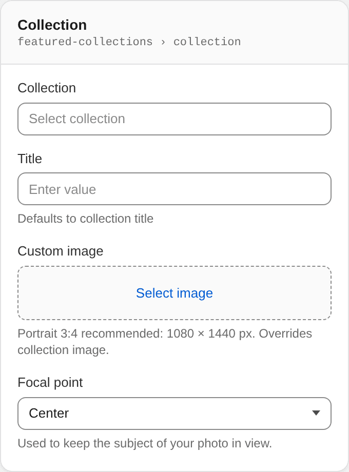
| Setting | ID | Type | Default | Notes |
|---|
| Collection | collection | collection | — | — |
| Title | title | text | — | Defaults to collection title |
| Custom image | image | image_picker | — | Portrait 3:4 recommended: 1080 × 1440 px. Overrides collection image. |
| Focal point | focal_point | select | center center | Used to keep the subject of your photo in view.<br>Options: Top left · Top center · Top right · Left · Center · Right · Bottom left · Bottom center · Bottom right |