Mobile
Version: 1.0.3
Routes: /, /transactions, /settings (and the shared navigation shell)
Who can access: Signed-in users on phone-sized viewports.
Screenshots
What this page does
Accounting Ledger is responsive. On phones, the sidebar becomes an off-canvas drawer, lists use compact cards where helpful, and primary actions stay reachable. Charts wrap labels cleanly, pagination stays compact, and the back-to-top control sits above page controls.
Layout at a glance
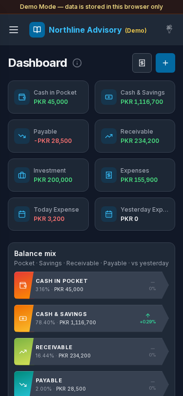
- Top bar: menu (hamburger), business name, utility icons
- Demo banner when running Demo Mode
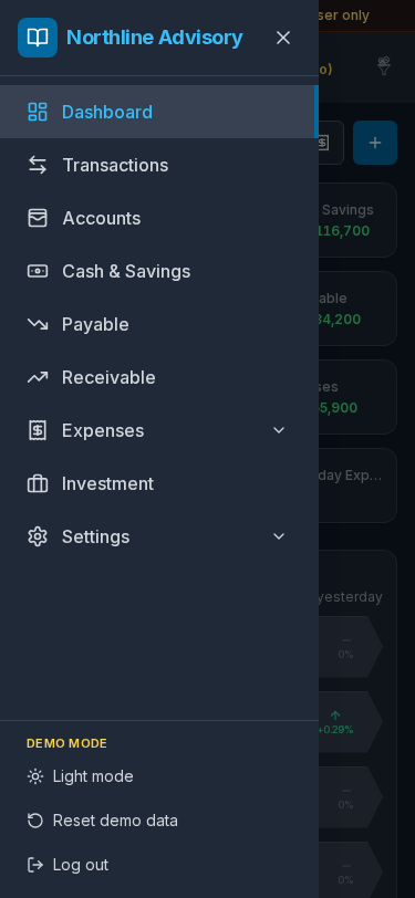
- Off-canvas nav with the same items as desktop: Dashboard, Transactions, Accounts, Cash & Savings, Payable, Receivable, Expenses (with Daily / Monthly), Investment, Settings
- Theme toggle and Reset demo data / sign-out options in the drawer footer where available
- Dashboard header: Transactions and Add as icon buttons
Steps
Open navigation
- Tap the menu (hamburger) control in the top bar.
- The drawer opens with the full app map (see screenshot).
- Tap a destination, or close the drawer with the X / outside tap.

Use the mobile dashboard
- After login, the Dashboard shows KPI cards in a compact grid.
- Tap Transactions (icon) to open the journal, or Add (plus) to post without leaving home.
- Tap linked KPI cards to open detail pages.
- Balance Mix ribbons and charts use wrapped labels; chart hover uses a light highlight (no solid white box).
Work transactions on mobile
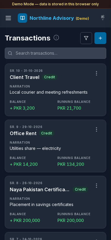
- Open Transactions.
- Each entry appears as a rounded card: Credit/Debit label, time + date on the dark curved tab, account name, amount badges, and Amount / Running footer.
- Use search and filters; tap Add to create an entry. Tap a card for Details.
- Pagination is compact: first and last page with
…between (current page when in the middle). - Scroll-to-top sits higher so it does not cover pagination.
Adjust settings on mobile
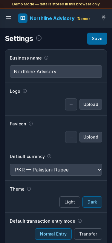
- Open Settings from the drawer.
- Edit fields and tap Save — same labels as desktop General settings.
- Under Send messages, edit account / transaction templates (Allow URL toggles included).
- Use Profile in the Settings submenu — email is view-only; edit the display name and sign out as needed.
Re-login on mobile (optional)
The login screen uses the same account cards as desktop. If you sign out, choose a Demo Mode account card again to return. A duplicate capture of the login screen exists for maintainers; mobile re-login matches the Login guide.
Errors & edge cases
- Narrow screens hide the persistent sidebar; always use the hamburger menu.
- Some tables switch to stacked cards — search still works the same.
- Demo data remains local to the browser; clearing mobile site data resets sandboxes.
- Landscape tablets may show desktop layouts; use portrait phone width for the screenshots above.